
Welcome to DataDesk
DataDesk is South Africa’s data and visuals platform for journalists, researchers and businesses. It gives you curated, ready-to-use datasets and interactive charts — no need to go hunting for source data and cleaning it up yourself.
This page is a quick visual tour for new users. For a full reference of every feature, see Getting started.
The dashboard
When you land on DataDesk you’ll see the dashboard — the home for everything in the library. Featured datasets sit at the top, and below that you can browse or search across all datasets, charts and graphics. Categories and collections in the sidebar let you narrow things down by topic.
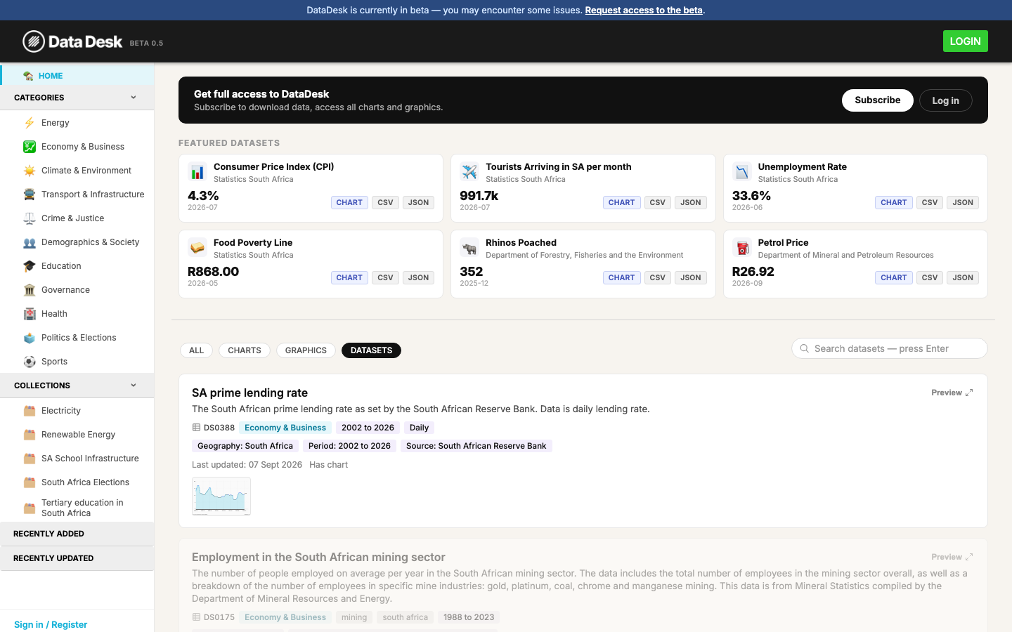
You don’t need an account to browse — anyone can view charts and datasets. You’ll just see a banner reminding you that downloads and full access need a login.
Finding what you need
Use the search box above the results list to search by keyword. Results are split into tabs — All, Charts, Graphics and Datasets — so you can narrow in on the type of content you want.
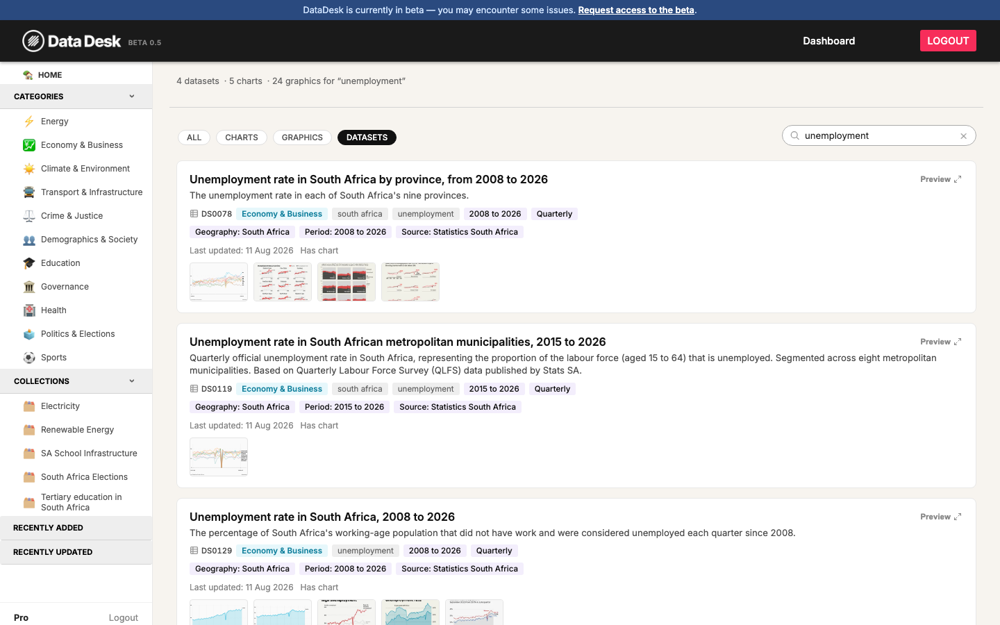
Each result shows its category, geography, time period and source at a glance, so you can tell whether it’s the right dataset before opening it.
Viewing a chart
Click into any chart or dataset to see the full page: the chart itself, a short description, and — depending on your account — options to download the data or customise how the chart looks.
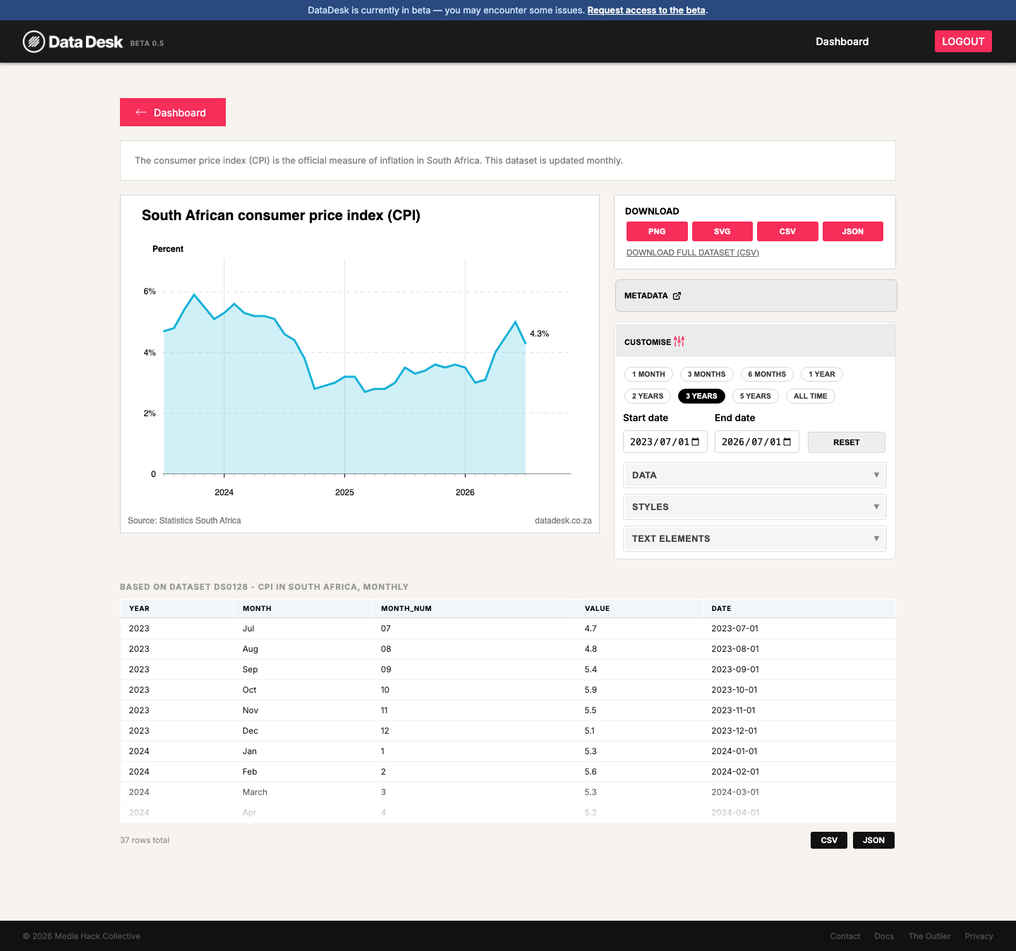
Below the chart you’ll also find the underlying data in a table, so you can check the numbers behind what’s plotted.
Customising a chart
If your membership includes customisation, opening the Customise panel lets you:
- Zoom into a specific date range, or jump to a preset like 1 year or 5 years
- Show or hide individual data series
- Toggle style options — area fill, markers, hover tooltips, value labels and more
- Override the chart title and subtitle
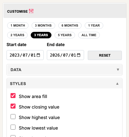
Changes apply live to the chart above, and are saved in your browser for an hour — so if you come back to the same chart shortly after, your settings are still there.
Membership tiers
DataDesk has four membership tiers — Community, Pro, Enterprise and Publisher — plus anonymous (not signed in) access. What you can do depends on which one you’re on:
| Access level | What you get |
|---|---|
| Not signed in | Browse all charts and datasets — no downloads |
| Community and above | Everything above, plus downloading data as CSV/JSON and PNG, and access to premium datasets |
| Enterprise / Publisher | Everything above, plus the Customise panel and chart embedding |
Your account page shows exactly what your tier unlocks, and what’s still locked:
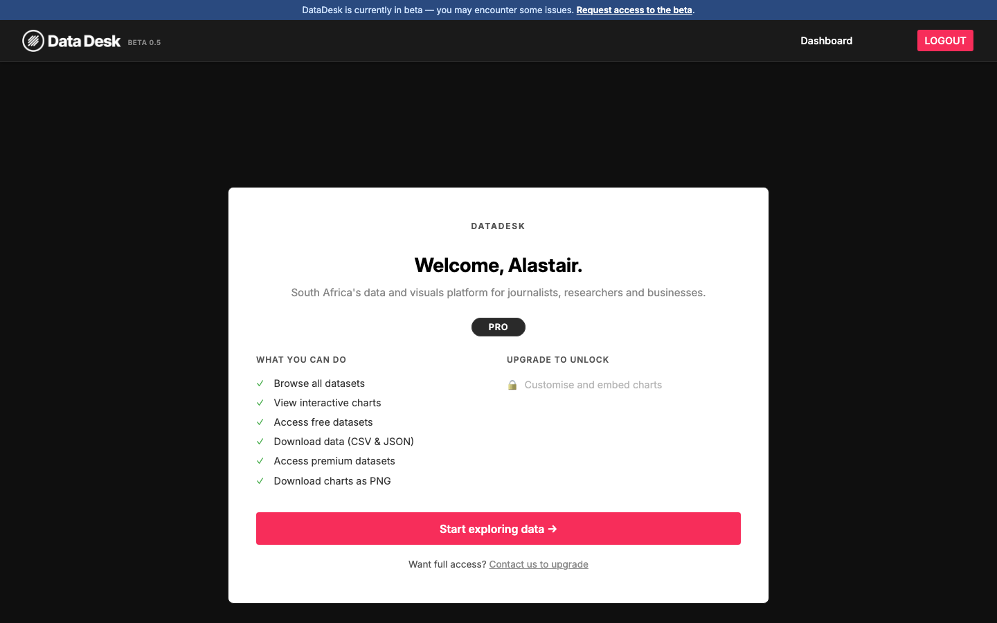
If you try to use a feature your tier doesn’t include — like the Customise panel — DataDesk will prompt you to sign in or upgrade rather than just failing silently.
Next steps
- Browse the dashboard and try searching for a topic you care about
- Read Getting started for the full walkthrough, including every customisation option and answers to common questions
- Want more access? Contact us to upgrade your membership